Cadbury Landing Page Redesign

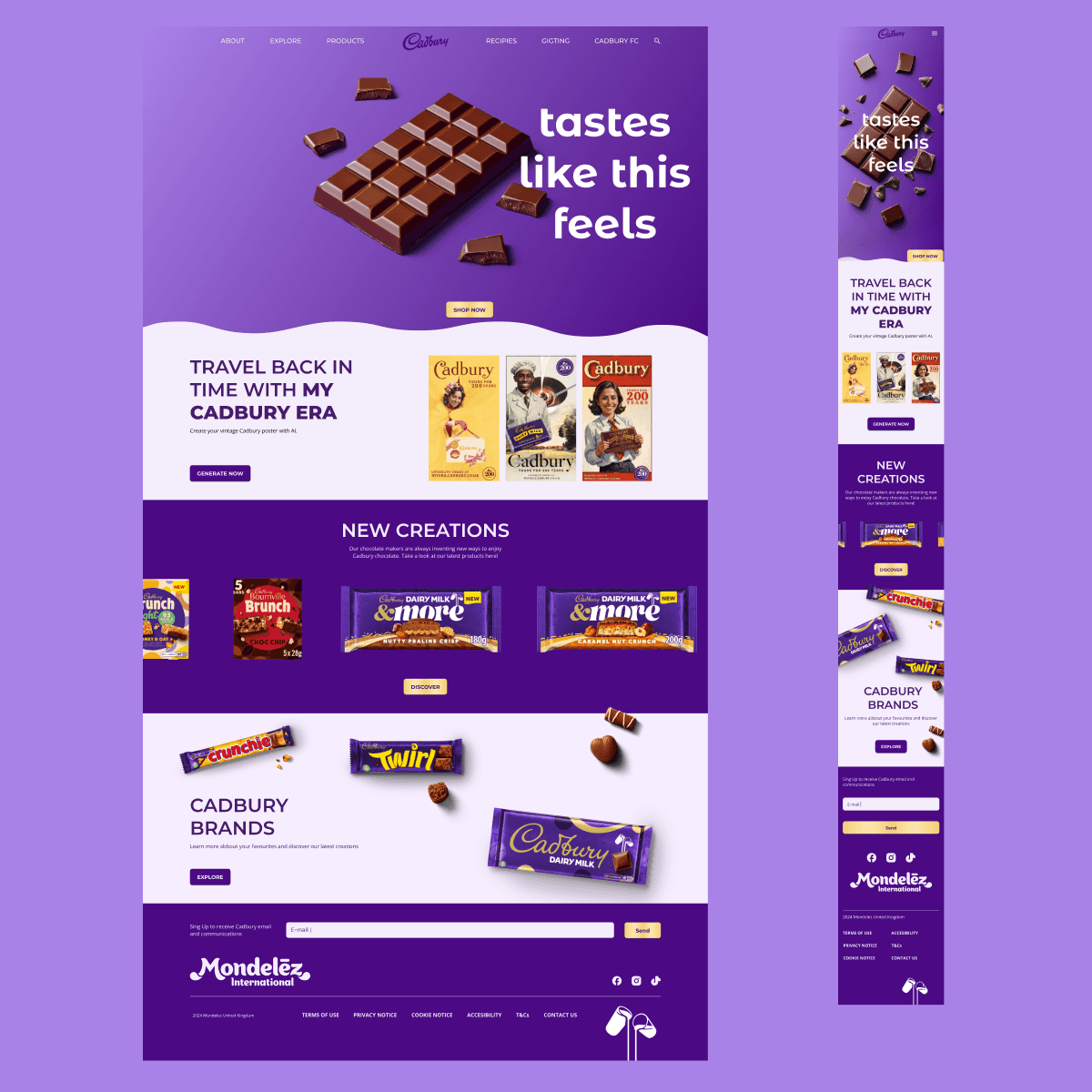
A refreshed and engaging homepage design aimed at enhancing the user experience while preserving Cadbury’s iconic brand identity.

UI Design

UX Design


Role

UI Design

UX Design


Role

UI Design

UX Design


Role

UI Design

UX Design


Role

Figma

Photoshop

lllustrator

MidJourney

Tools

Figma

Photoshop

lllustrator

MidJourney

Tools

Figma

Photoshop

lllustrator

MidJourney

Tools

Figma

Photoshop

lllustrator

MidJourney

Tools

2024

Year

2024

Year

2024

Year

2024

Year

1 week

Duration

1 week

Duration

1 week

Duration

1 week

Duration

English

Language

English

Language

English

Language

English

Language

In a Nutshell

This project involved a complete redesign of the landing page for Cadbury UK’s website. The goal was to improve the user experience by creating a more intuitive, visually engaging interface while staying true to the brand’s rich identity. The project required quick decision-making and efficient execution within a one-week timeline.

Understanding the Challenge

Cadbury’s website needed a more modern and user-friendly homepage that aligned with contemporary design standards while maintaining its recognizable branding. Key areas for improvement included:

  • Visual consistency: Strengthening brand identity across digital touchpoints.

  • Usability enhancements: Improving navigation and accessibility for a smoother browsing experience.

  • Responsive design: Ensuring seamless adaptation across all screen sizes.

The Approach

The Approach

The Approach

The Approach

With limited time, I focused on an efficient yet thoughtful design process:

  • Quick analysis: Evaluated the existing homepage to identify pain points.

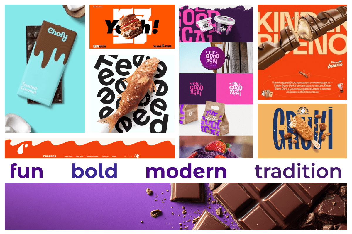
  • Visual direction: Developed a moodboard and style board to define the aesthetic approach.

  • UI system setup: Created a design system with colors, typography, and UI components.

  • Layout design: Built a clean and structured homepage optimized for engagement and responsiveness.

  • Testing & refinements: Ensured the design was visually cohesive and worked across different screen sizes.

Inspiration & Research

To establish a strong foundation for the redesign, I began by analyzing Cadbury’s existing branding, including digital campaigns, packaging, and overall visual identity, to understand its core aesthetic and messaging. To further refine the direction, I created a moodboard, compiling visual references that aligned with the brand’s essence while introducing fresh inspiration.

Key insights from this phase:

  • Brand evaluation: Studied Cadbury’s existing assets to ensure consistency in the redesign.

  • Moodboard creation: Compiled visual references to guide the refreshed design language.

  • Competitive research: Assessed industry leaders and their digital strategies.

  • Visual exploration: Gathered references from modern UI trends to guide design decisions.

Visual Execution

With the research insights in mind, I developed a refined design that balanced Cadbury’s heritage with a fresh, modern appeal. I carefully selected a color palette and typography that preserved brand recognition while improving readability and modernizing the aesthetic.

Key design considerations included:

  • Product visibility: Structured the layout to highlight key offerings effectively.

  • Intuitive UI components: Designed buttons, navigation elements, and interactive sections to enhance user engagement.

  • Visual consistency: Ensured a cohesive look across all elements for brand alignment.

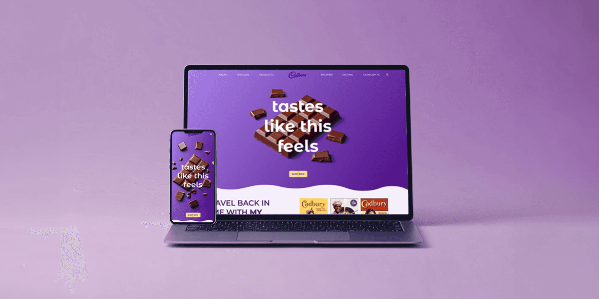
Additionally, I applied responsive design principles to create a seamless experience across various screen sizes, maintaining usability and clarity on both desktop and mobile devices.

Responsive Design Considerations

A key objective was making the homepage fully responsive, ensuring a seamless experience across all devices:

  • Mobile-first approach to prioritize accessibility.

  • Scalable UI elements that adapt fluidly to different screen sizes.

  • Consistent branding and readability across desktop and mobile views.

To embed a website or widget, add it to the properties panel.

Final Design

Final Design

Final Design

Final Design

To showcase the final outcome, I created a prototype flow recording, demonstrating how users navigate the app, browse products, and complete a purchase. This recording highlights the smooth interaction flow, intuitive navigation, and engaging design choices that enhance the overall user experience.

Key Takeaways

This project reinforced the importance of balancing brand heritage with modern UI practices.

  • Designing within a tight deadline sharpened my ability to make fast, effective design decisions.

  • While user research was limited, applying UX best practices ensured a strong user-centered outcome.

Even though this was a fast-paced challenge, it was a great opportunity to refine my UI and branding skills while tackling a real-world design problem.
© 2025 Tomas Leyro Diaz

© 2025 Tomas Leyro Diaz

© 2025 Tomas Leyro Diaz

© 2025 Tomas Leyro Diaz